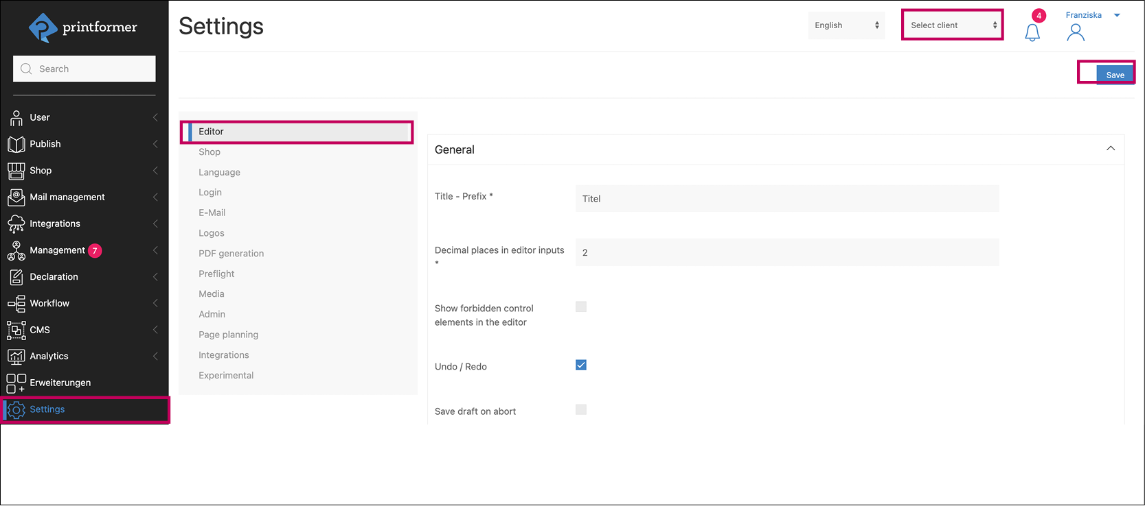
Editor
The printformer editor offers user-friendly editing of templates in real time.
It can be individually configured in this settings menu.
In a system with multiple clients, you can switch between the settings of individual clients using the top dropdown menu. (To customize specific clients, the respective 'Use Standard Configuration' checkbox must first be deactivated.)
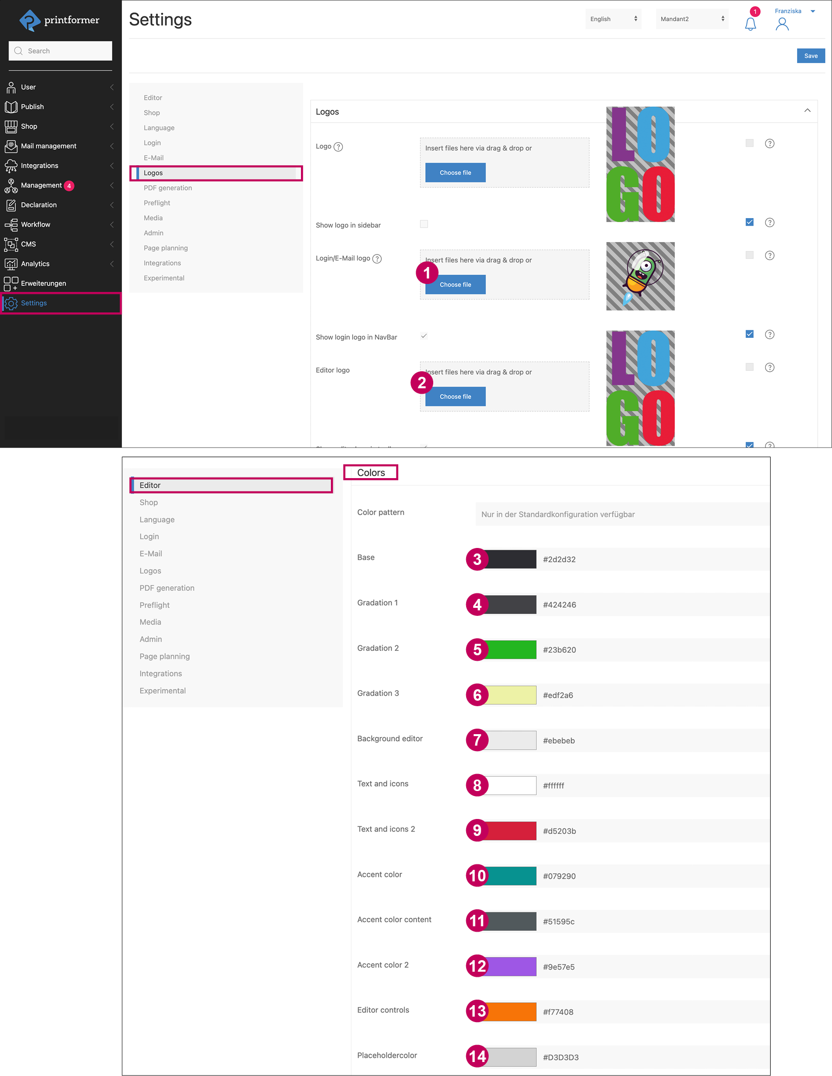
Logos und Colors
Logos | |||
1 | Settings > Logos > Editor logo | Image-File | |
2 | Settings > Logos > Favicon | Image-File (96x96 px) | |
Colors | |||
Settings > Editor > Colors | Hexadecimal color value (RGB) | ||
3 | Base (Menu bars) | 9 | Text and icons 2 (pop-ups) |
4 | Gradiation 1 (active Menu) | 10 | Accent color (continue button) |
5 | Gradiation 2 (pop-up Menu) | 11 | Accent color content (continue button) |
6 | Gradiation 3 (pop-up Editor) | 12 | Accent color 2 (Schmuckleiste) |
7 | Background editor | 13 | Editor controls (active Block border) |
8 | Text and icons (Menu) | 14 | Placeholdercolor (Text color in form editor for pre-defined Template DataKeys) |
Settings > Editor > Notices and validation > Highlight editable elements | |||
15 | Color for highlighted elements | ||
Additional Settings
Setting | Description | |
|---|---|---|
x These fields can be adjusted for individual templates in their configuration. | ||
General | ||
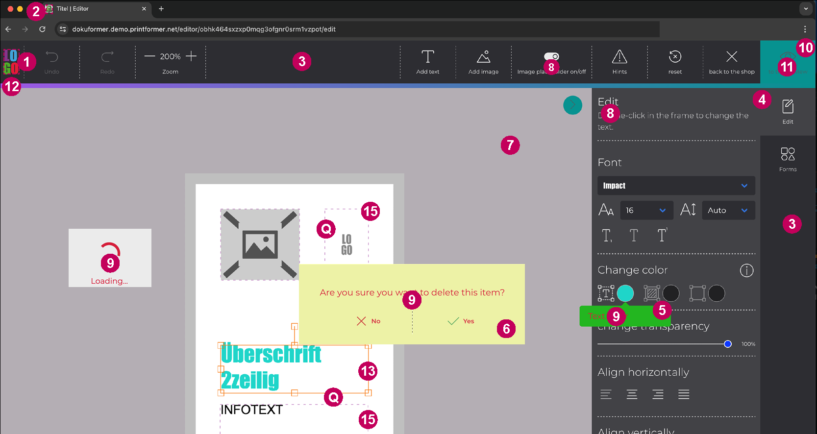
A | Title - Prefix | Desired name in the browser |
B | Decimal places in editor inputs | Displaying mm value in the editor (e.g., element size/position) |
C | Show forbidden control elements in the editor | Non-selectable buttons are displayed (grayed out) |
D | Undo / Redo | Show Undo and Redo buttons |
Save draft on abort | Save edited template as a draft even if the editing is not completed (in the template configuration Editor > Toolbar, an additional Save button can be activated) | |
|
If the Save draft on abort checkbox is selected, the setting Ask users if they want to save when canceling is hidden. | ||
Ask users if they want to save when canceling | If this checkbox is enabled, an pop-up will appear when leaving the editor (the text for this can be adjusted in the language file) | |
Maximum file size for uploads in the editor (in MiB) | Maximum size for uploading assets in the editor | |
Maximum file size for uploads in the upload editor (in MiB) | Maximum size for uploading assets in the upload editor | |
E | Draft reset | Reset template to its initial state, customizable text |
F | Use wide sidebarx | Use enlarged side menu (toolbar) |
Show form editor fields per pagex | If a template with placeholders has multiple pages, only the fields of the selected page are displayed | |
G | Show/hide image placeholders | Button to toggle display of image placeholders |
Show image placeholder by default | If this checkbox is deactivated, empty image blocks are displayed in the editor without a placeholder image | |
Columns in the sidebarx | ||
Media, Pages, Article Templates, Page layout, Variants, Group templates | Here, the number of columns for each sidebar menu can be adjusted (thus defining the size of the thumbnails displayed there): 1-4 columns | |
Pages | Additionally, there's an option to choose a double-page view. In this view, the first and last pages are displayed individually in the column, while for all other pages, two pages are shown side by side | |
Article template / Containerx | ||
Hide Article Templates overview in editor | Hide article template menu in the sidebar; useful when only one article template is available per container | |
Gray out already used article templates | Article templates that have already been placed into a container are displayed in the sidebar as grayed out | |
This determines whether the container can be filled with an article template if it contains only one of the given tags or if it must contain all tags | ||
Display article templates based on content requirements per page | This determines all tags of the current page and pre-fills them as tag filtering. (This filter is not overwritten by selecting a category, for example). | |
Highlight container on drag&drop | Behavior of the container when dragging an article template over it: either the outline or the surface of the container will be colored (highlighted) | |
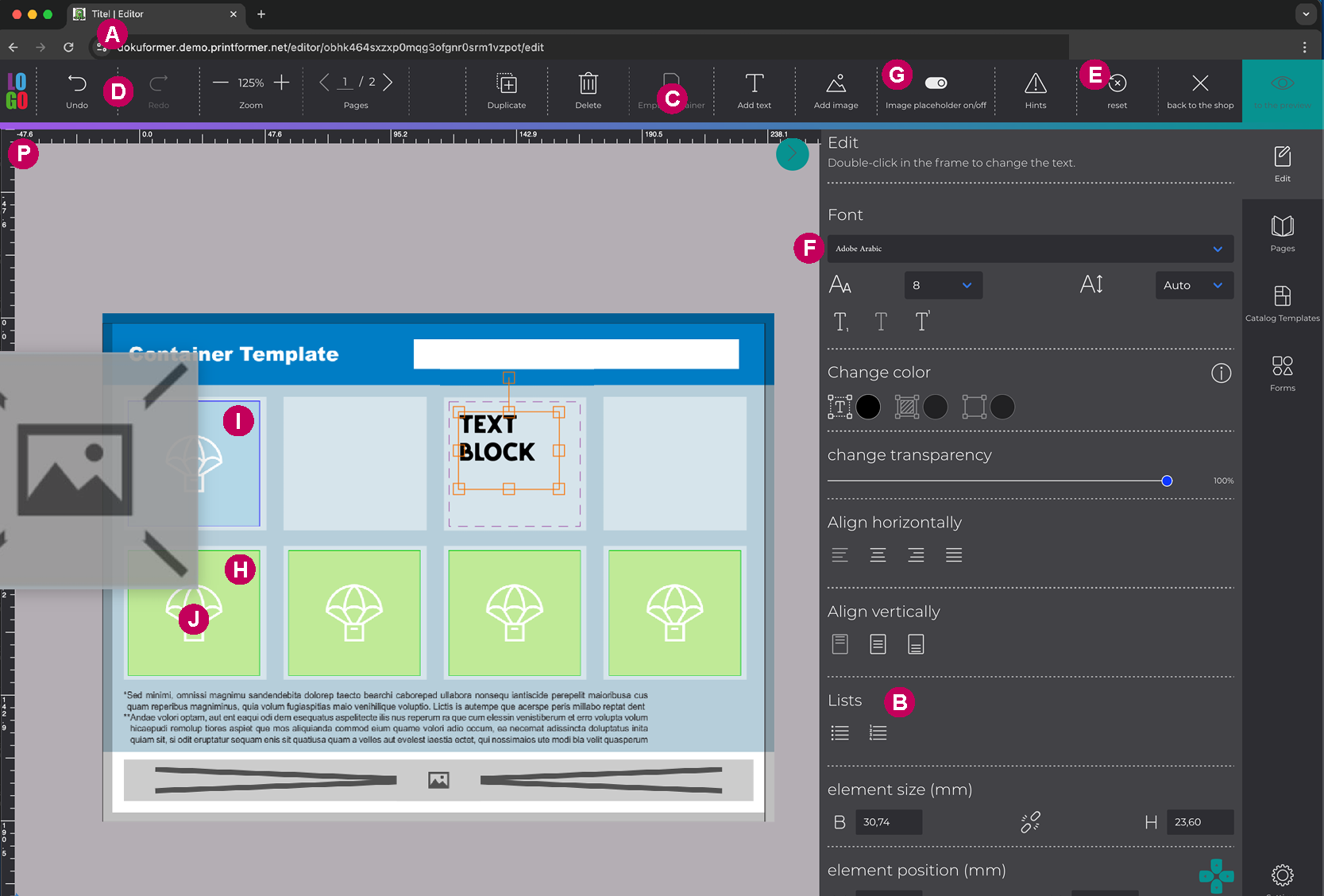
H | Color on dragstart | Selection of the highlight color when choosing an article template |
I | Color on dragover | Selection of the highlight color when placing an article template into the container |
J | Show icon in container at start of drag | In addition to the color highlight of the container(s), an icon appears in the container. Note: the icon cannot be deactivated for GridContainer, as it indicates where the article templates can be placed |
Container blacklist for catalog products | Comma-separated list of content requirements for containers that should not be highlighted during the drag and drop of article templates | |
Variants | Set sorting (alphabetically or by creation date) | |
Autosave | Activate autosave, time setting (how many seconds between each save) | |
Notices and validation | ||
Option to enable prompts, error messages (pop-ups), help buttons, and define them | ||
Expand notifications sidebar on (the selected level includes the level below) | Here, you can choose whether a sidebar with hints should automatically expand (Never means that hints will only be displayed via a notification in the top bar) | |
Warning when closing the editor | If activated, a warning appears when the browser (or tab) is closed | |
Point to unvisited pages | If not all pages have been clicked through in the editor, a message appears. This can be freely defined. | |
Indicate unfilled containers | If not all containers in the editor have been filled with a product or article template, a message appears. This can be freely defined. | |
Indicate unloaded assets | Note if uploaded images have not yet been fully loaded into the editor. Text can be freely defined. | |
Error with | These properties can be defined as errors, as a result of which the information text is highlighted in red. If the Leave editor despite error checkbox is not activated, the user can only continue to the preview after correcting the error. | |
Error with missing mandatory feed item identifiers | If mandatory products are defined for page planning, you can determine here whether not placing the products should appear as an error or a warning | |
Leave editor despite errors | If this checkbox is disabled, a preview/print PDF cannot be generated if the block content validations are not met | |
15 | Highlight editable elements | Selection between never, always, and on hover color value in hexadecimal |
Q | Thickness of the border around highlighted elements | The stroke width of the activated and highlighted (block) frames can be defined here in 6 steps (thin to thick) |
Show help button | Activate info button in the top menu (editor) | |
URL to the external help page | Linked URL of the help button. By default, the system configuration has the target URL set to https://docs.printformer.com, which can be overridden here or in individual tenants | |
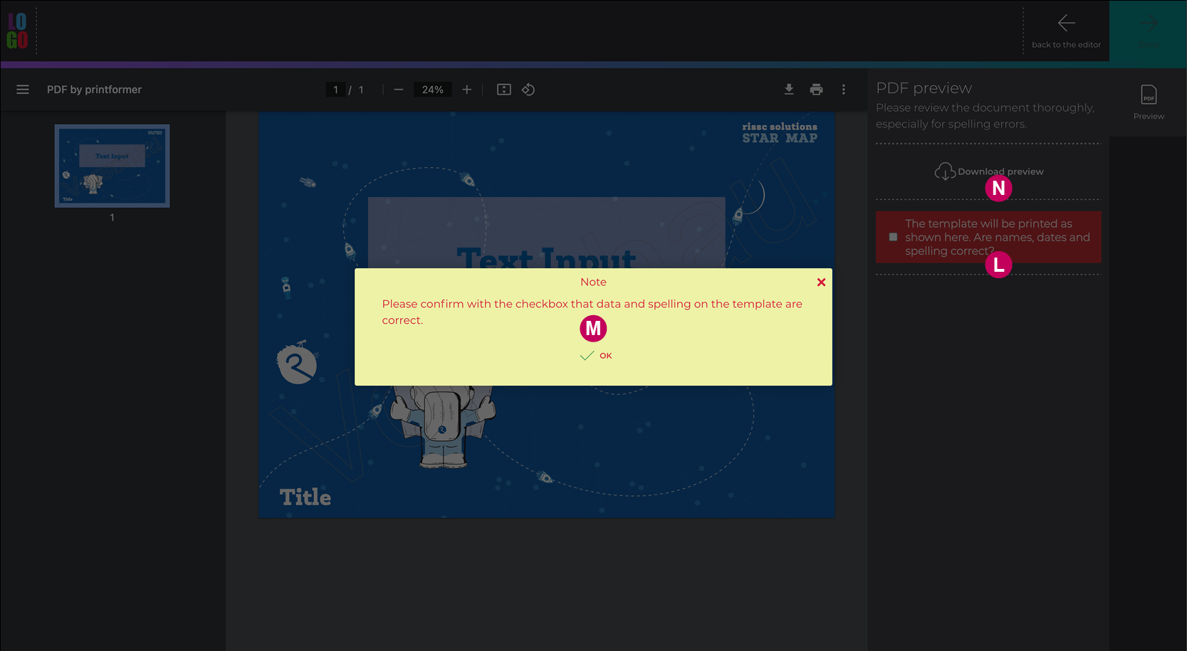
Preview | Determination of whether the preview must be released, incl. texts for confirmation label and message | |
L | Confirm preview | To be able to complete the order, the preview must be enabled via the checkbox. |
L | Preview confirmation Label | Text input for the confirmation label |
M | Confirmation message | Text input for pop-up if confirmation label has not been activated |
N | Enable preview download | When deactivated, the download button in the sidebar is hidden (however, the download option via the PDF viewer cannot be removed) |
File name | Possibility to define the file name (e.g. using DataKeys) (e.g. a timestamp | |
Show draft validation messages | Only possible with the Draft Validator feature | |
Toolbar Buttons(above Menu bar) | Free choice of text for the buttons Return to store, Continue to preview, Return to editor, Finalize design | |
Sidebar Buttons (side Menu bar) | Free choice of text for the buttons on the side menu bar (Define via Language-Picker) | |
|
If the template (or a page within the template) consists solely of placeholders that can be filled using the form editor (without editable blocks), the Edit button is automatically hidden. | ||
P | Activate rulers and auxiliary lines (if magnetic auxiliary lines are activated, objects will dock to these lines as soon as they are dragged within the threshold value) | |
Grid* | Display grid and settings | |
Loader | Free choice of texts to be displayed during general or loading of the template | |
Block restrictions | Block restrictions, BlockSettingPresets and Block attributes can be defined here across systems or clients. | |
Themesx | Selection of the default editor UI (at system or client level) | |