
GridContainers
GridContainers are placeholders that can be filled with several article templates according to a raster setting. The grid of the GridContainer is defined in the InDesign document by an attribute.
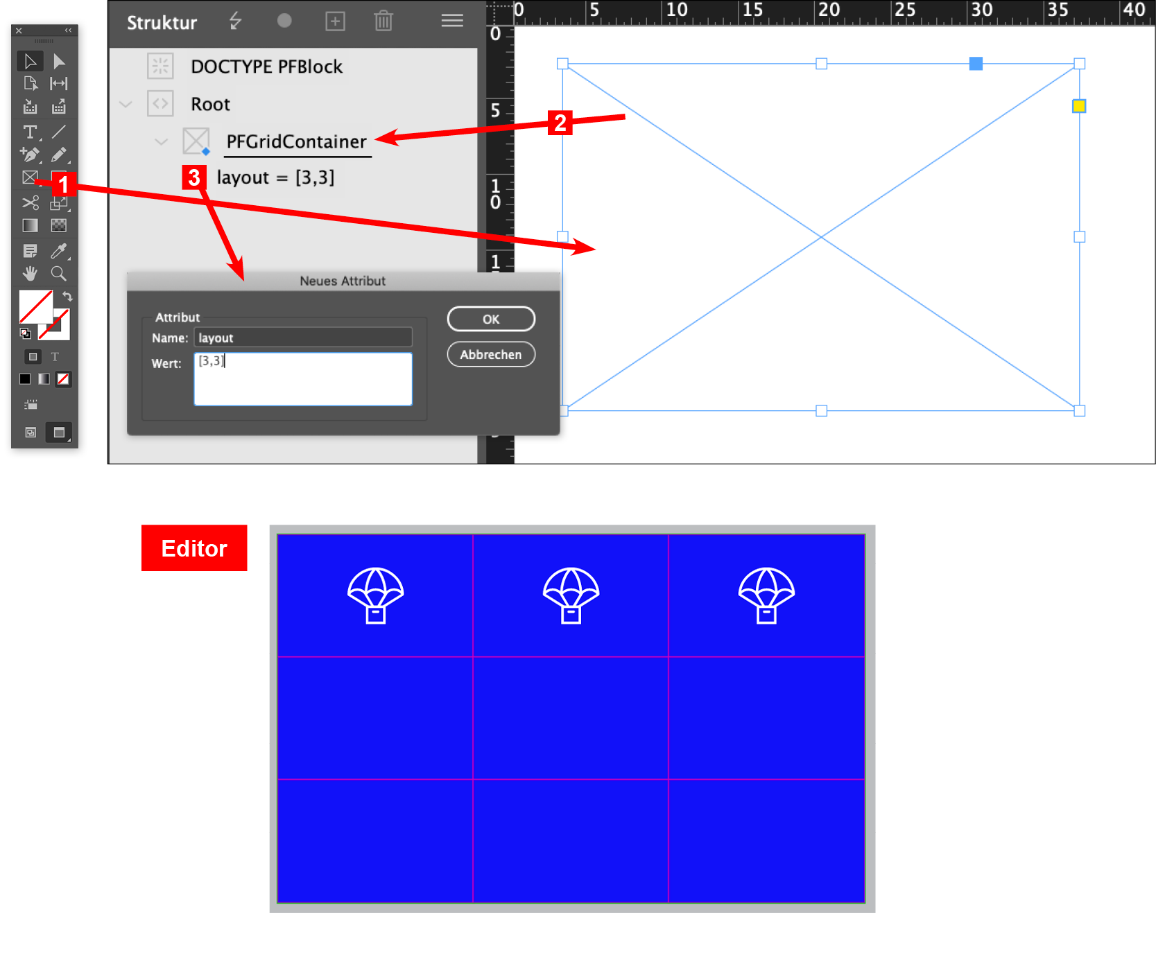
Graphic frames (Tool Rectangle Frame) of any template in InDesign can be designated as containers with the tag »PFGridContainer«.
To this an attribute with the name layout is added. The value defines the grid of the container: two comma-separated integers are entered in a square bracket. The first value defines how many units (number of columns) the container should have horizontally, the second value calculates the vertical division (number of rows). For example, if a container is to be created with a grid of 9 areas, the value is [3,3]. The graphic frame is divided horizontally and vertically by 3.
If you want to automatically provide articles inserted in the container with a frame, this can be defined as a stroke at the GridContainer in the InDesign document (stroke thickness and color). The frame is always as large as the grid, even if the inserted article is smaller.
Settings in printformer
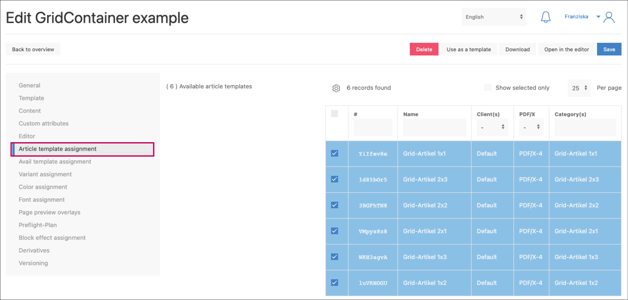
The corresponding article templates must be created separately in InDesign and in printformer (see configure PF templates).
Make sure that their format is similar to the grid, i.e. that they fit exactly to columns and rows. If the articles are smaller, they can be aligned (horizontally and vertically) or moved in the container. Article templates should always be created without bleed.
For inserting article templates into the container later, an additional tag must be added in the printformer (after uploading the template), which indicates the format of the template. This is again defined by the number of units in the grid, the notation is "number of columns"x"number of rows".
For our previous example there are 9 possible formats: 1x1, 1x2, 1x3, 2x1, 2x2, 2x3, 3x1, 3x2, 3x3
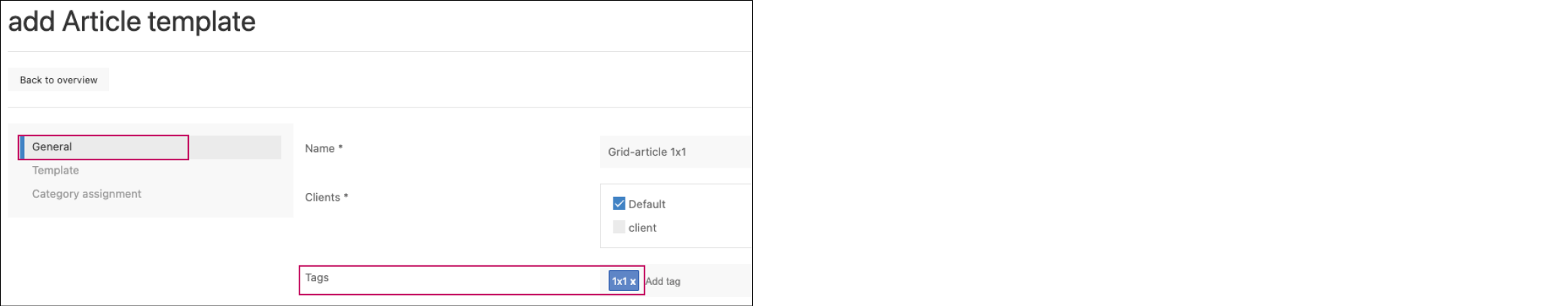
(The tags are typed/copied into the Tags field and then added by pressing the Enter key).
Examples format article template and tag:
The size of the grid container is 60x30 mm and is divided into 9 areas via layout (3x3):
an article template in the format 20x10 must then be marked with the tag 1x1
article template 40x10 = 2x1
article template 20x30 = 1x3
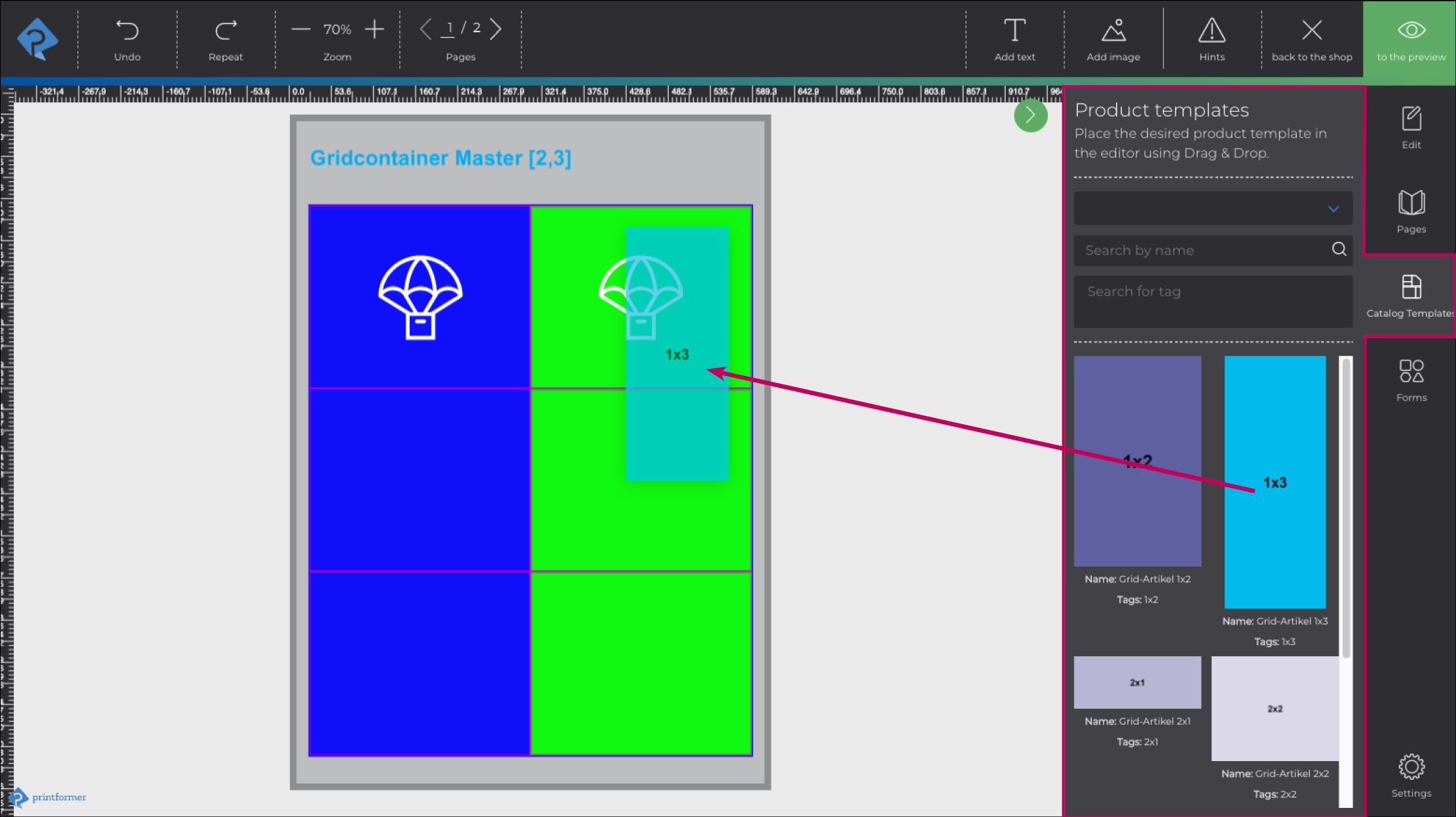
After master and article templates have been configured in printformer, the articles must be assigned to the master.
Thus, when editing the template in the editor, the Catalog Templates tab automatically appears (sidebar) from which the articles can be inserted into the grid areas of the container via drag&drop.
Attributes | ||
|
The values listed under name are individual attributes of the tag PFContainer and are entered as name, the possible values are listed in the second column. If the cell is empty, the value is freely selectable. | ||
name | value (Limitations) | Usage |
layout | Arrangement (array) with integers e.g. [2,3] | The layout specifies how many units the GridContainer consists of. The first number stands for the number of columns and the second number for the number of rows. |
h-align | left, center, right | Automatic horizontal alignment of the article template |
v-align | top, center, bottom | Automatic vertical alignment of the article template |
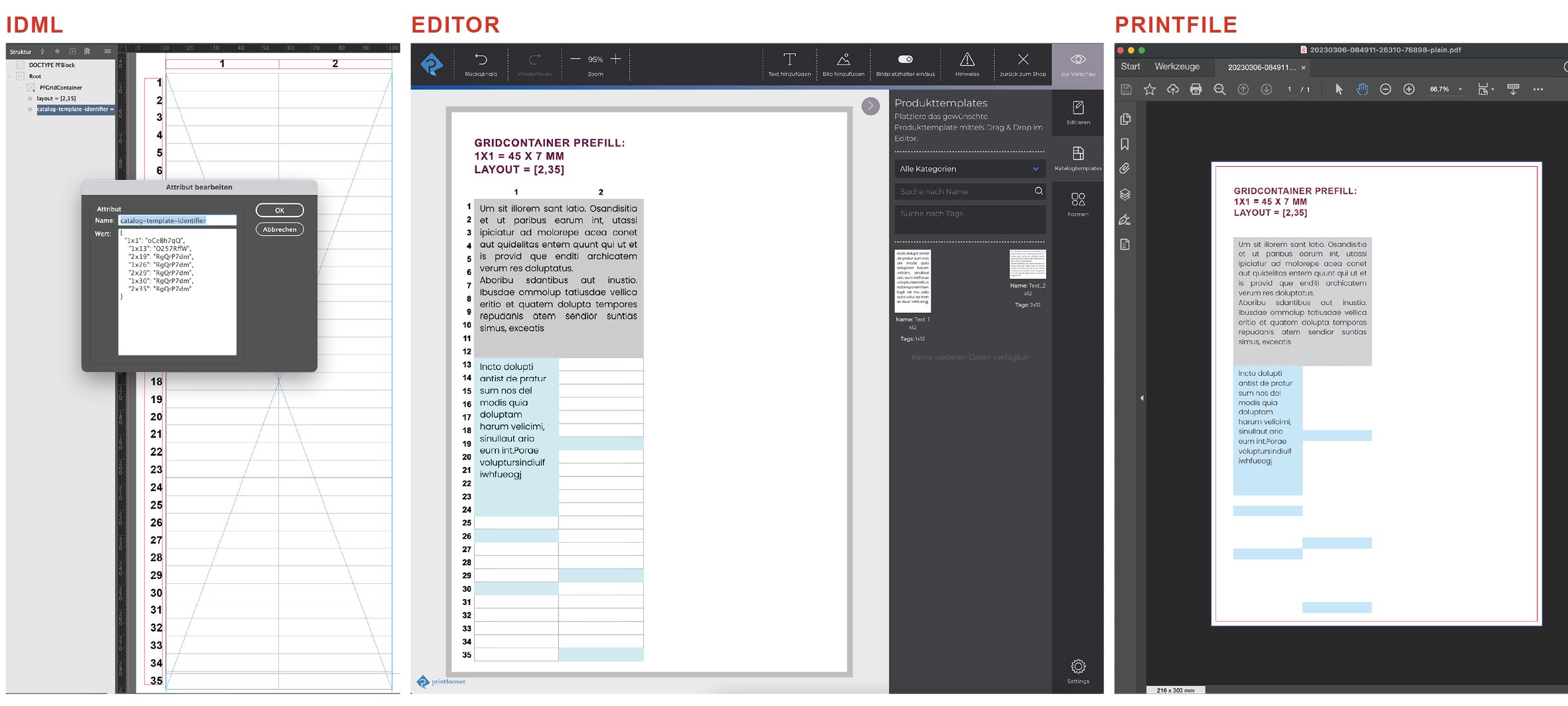
catalog-template-identifier | { Example:
CODE
| Hereby the GridContainer can be prefilled with several article templates. The value is specified in JSON, column and row are used (as coordinates) and the identifier of the wanted article template is given (see also screenshot below). In the example on the left: In general, it is important to consider how many columns and rows a template needs, so that there is no overlapping. And that the listing of coordinates and templates are comma separated. |
settings | Valides JSON-Format | |
Prefill GridContainer example
Editor Settings
In the General Settings > Editor > Article template/Container the following settings can be made for the appearance in the editor:
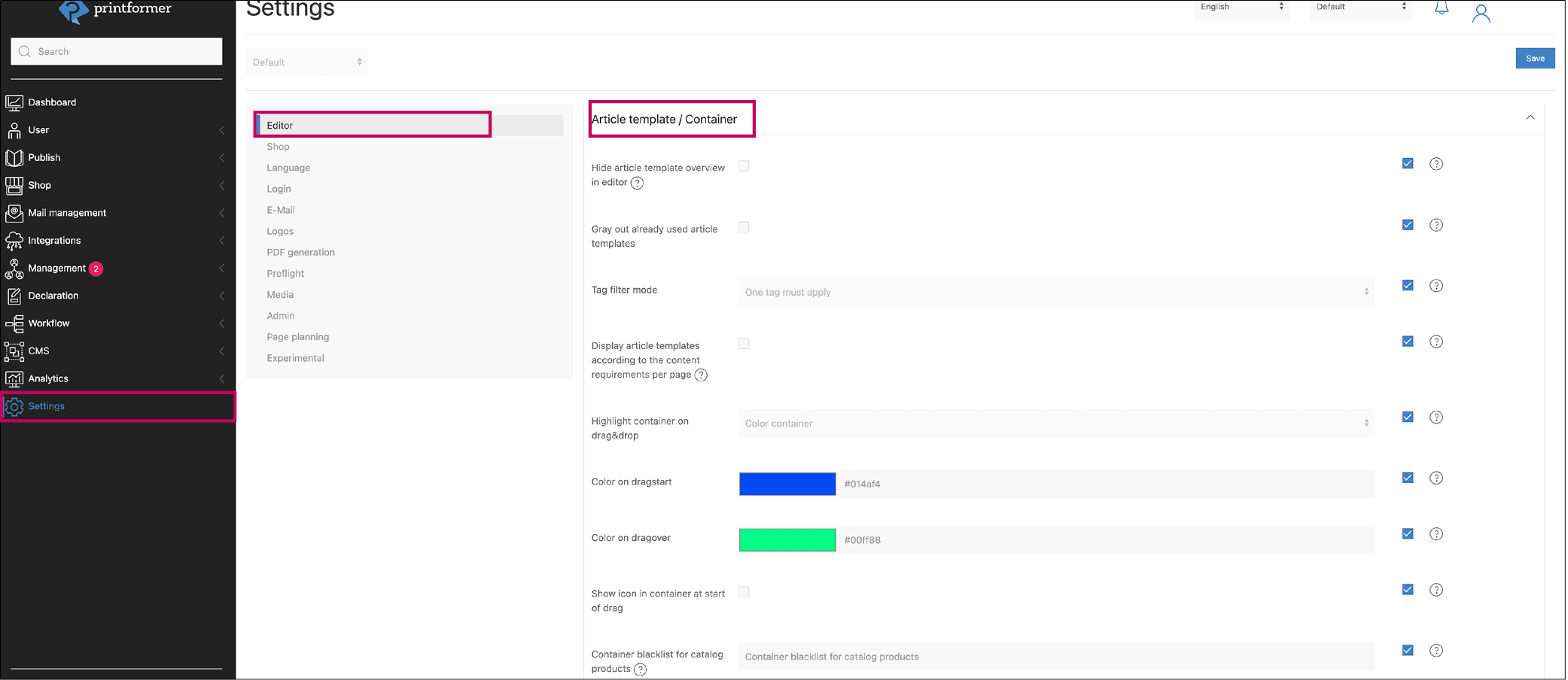
Setting | Description |
|---|---|
Hide article template overview in editor | sinnvoller Einsatz wenn pro Container nur ein Artikeltemplate zur Verfügung steht |
Gray out already used article templates | Article templates that have already been dragged into a container are grayed out in the sidebar |
Tag filter mode | This specifies whether the container can be filled with an article template if it contains only one of the predefined tags or whether it must contain all tags. |
Display article templates according to the content requirements per page | If there is a container without content-requirements on the current page, no filtering will be performed. |
Highlight container on drag&drop | Behavior of the container(s) when dragging an article template over: outline or area (container) of the container is colored (highlighted) |
Color on dragstart | Highlight color when selecting an article template |
Color on dragover | Highlight color when dragging an article template into the container |
Show icon in container at start of drag | (in addition to the color highlight of the container) an icon appears in the container |
Container blacklist for catalog products | comma-separated list of content-requirements for containers which should not be highlighted during drag&drop of article templates |